
There are many pages of tables & charts, all formatted in the same fashion. All pages should be updated by around 8pm CST each day. From about 5 – 7:30pm CST each day the charts and/or tables may display incorrectly while the autonomous scripts are running.
Please look at these tips to understand how to quickly analyze the tables & charts for decision making.
- The tables & charts facilitate the “Visual Investor” to browse through a few pages and make some quick assessments about the performance of particular models and the ETF’s that compose them. All assets on these pages have already been chosen/researched, so at this point I am looking at performance and am not concerned with portfolio architecture.
- For each study/page the Gradient of the table and the Palette of the chart are set by the longest time span or top most chart. This is setting your “average” performance in relation to the other assets.
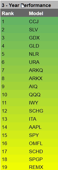
At left is the Gradient set & applied to longest time frame, the first table on each page. The gradient is “sticky”, with each model/ETF retaining it’s color through all subsequent runs on that page.
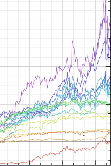
At left is the Color Palette as it is set on the first chart on each page. The color palette is consistent for all charts on a page. The palette is sorted by the rank on the first table on the page.
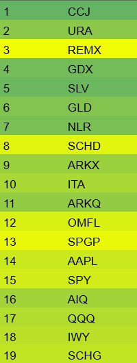
Here we have an example of a shorter time frame, showing that some assets are now performing better or worse than the original time span. In this example REMX has improved considerably, while SLV has performed worse.
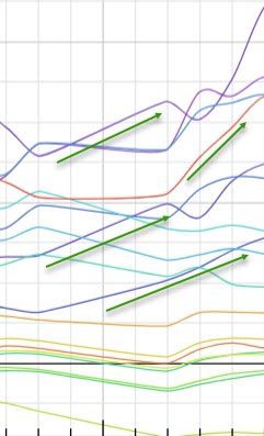
Here is an example assets that are going “against the grain”. They are going up while others are flat.
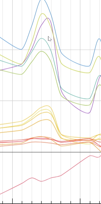
Patterns in the color palette will often show sector grouping and rotation. I have set the color palette with Metals in the Blue/purple range, Robotics/AI in Aqua’s, Software/LG Cap in green/orange. The grouping can be discerned in both the ETF’s and models that have more/less metal in them (on some time spans). REMX is an outlier that I added this year, because I observed it running against the grain in shorter time frames.
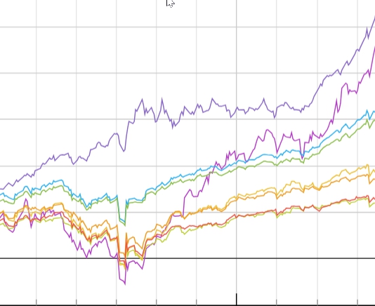
An example of GLD sailing right through the Tariff Tantrum performing well as a hedge. Also we can see AI/Uranium taking off & running hot.
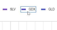
Click on an asset in the chart legend to highlight it on the chart.
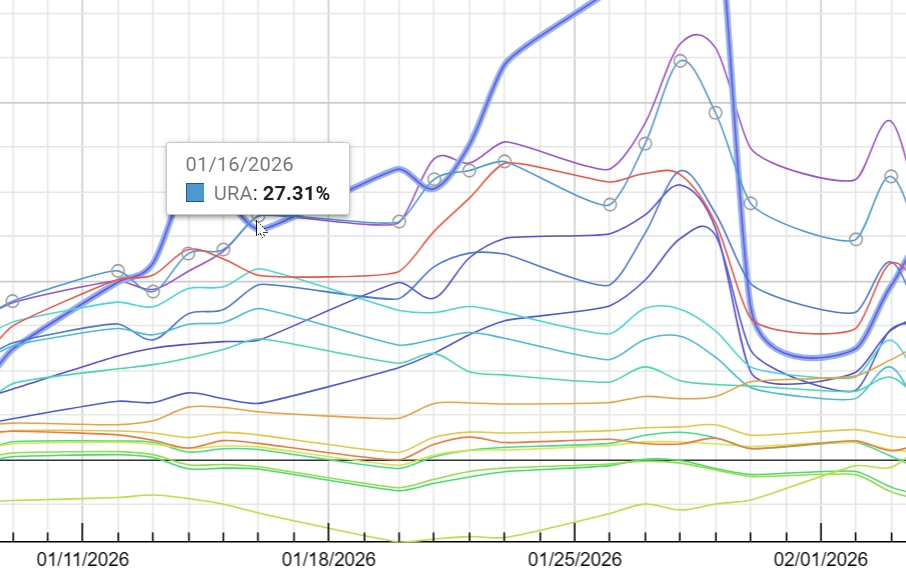
You can hover over the chart and highlight an asset. Charts show calendar days on which stocks do not trade. You need to be hovering over a trading day to invoke the highlight.
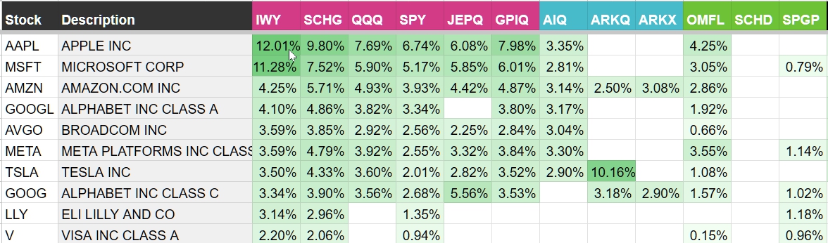
The ETF Matrix is a tool that allows you visualize concentration and non-correlation between ETF’s.